Client
SenS Online Solutions
Time
feb. 2022 – jul. 2022
Software
Adobe XD, Figma, Notion, Miro
Category
Branding, Visual, UX, UI
Summary
Working has changed a lot since the corona crisis. Like with many companies, the young professionals at SenS Online Solutions work hybrid, or even full-time from home. This causes problems regarding in-house communication.
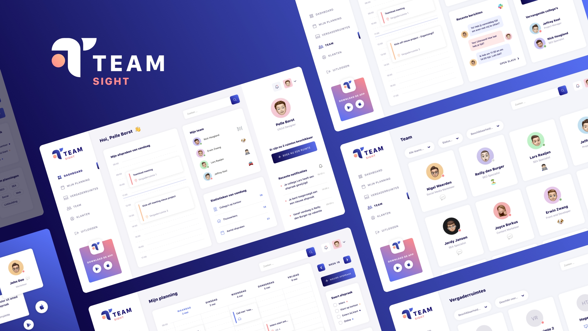
With TeamSight, young professionals can manage their appointments, schedule new ones and view updates from colleagues from anywhere in a flexible and efficient way.
Young professionals have more time to invest in customers because of the integrations with Slack and Gripp.
The unique thing about this concept is that it’s an all-in-one tool. In addition, there are two separate flows to schedule a new appointment, so that even the customers with a full agenda can find a suitable moment.
Problems to solve
Companies communicate less and less via e-mail. Mail is not accessible enough for fast in-house communication. Chat software such as Teams, Yammer and Slack are becoming increasingly popular. Most appointment management and scheduling tools still rely on email.
The rapid growth of SenS Online Solutions and the increasing demand for flexibility from the target audience mean that the lack of in-house communication is causing more and more points of irritation.
In addition, the current planning tool, Outlook Calendar, is very cluttered because all office appointments are placed in one calendar. Due to the lack of overview, doubled appointments are regularly scheduled. Managing and reading this agenda takes a lot of time.
Research
For this project I have done my own research. Over the course of two months I used various methods to answer many design questions. all research methods can be read in detail in my product biography
Branding
The name of the concept actually consists of two words. Teamwork and Insight. These words describe the purpose of the concept.
Managing and scheduling appointments is still seen as boring administration. By means of a fresh and modern house style I wanted to move away from this image. In addition, I design for a young target audience. This fits together nicely. The usability test has confirmed that the colors and style expressions match the wishes and needs of the young professionals.
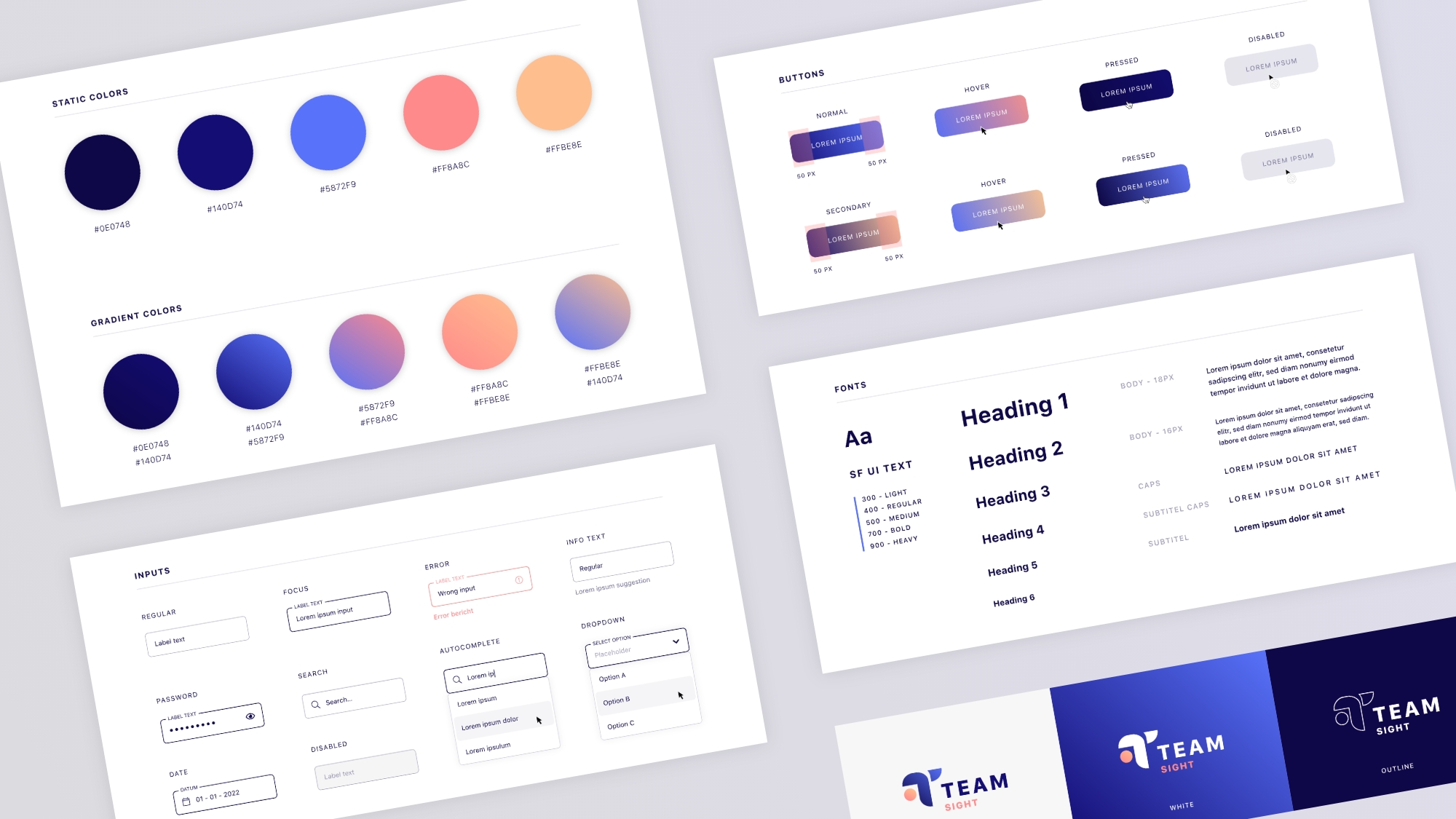
Design System
The design system is used to give guidelines to developers and team members who might work on the project in the future. The main components such as fonts, colors, inputs, buttons, etc. are described and designed.
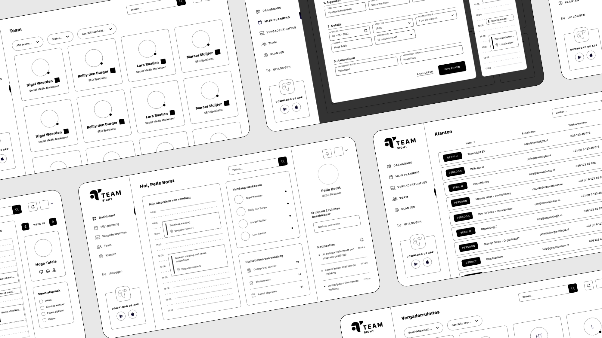
Wireframing
The wireframe phase was started with a sitemap and flowchart of the main functionalities. The content of the lo-fi prototype was generated with the help of the target audience through a co-creation session.
Usability testing
The lo-fi prototype was used for the first usability test to test whether the concept is desirable and whether the functionalities are in line with the wishes and requirements of the target group. This was an iterative proces that eventually resulted in the high resolution prototype.
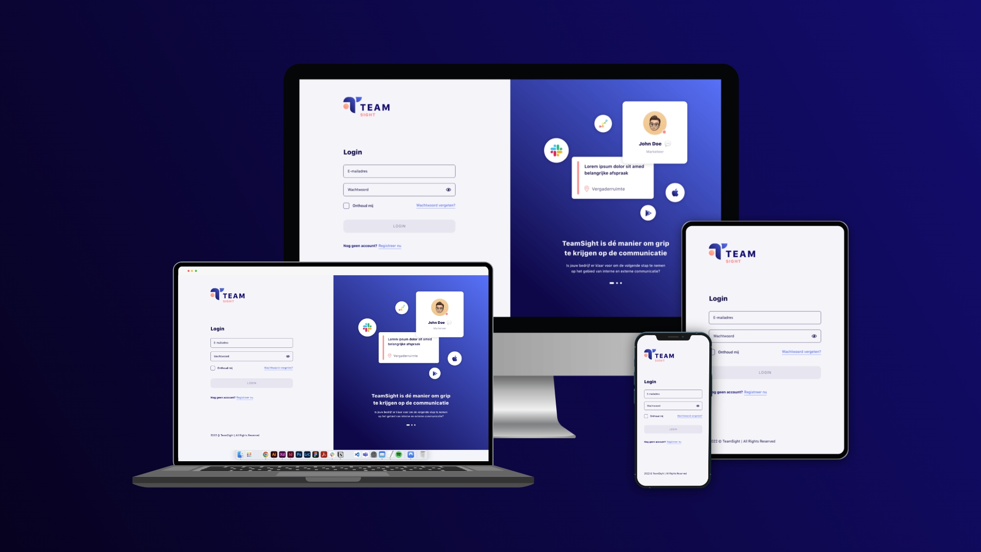
Final product
The end product meets all predefined success criteria. The design challenge has been achieved. This project has been assessed by the Amsterdam University of Applied Sciences with an 8.5 and a golden dot award nomination.